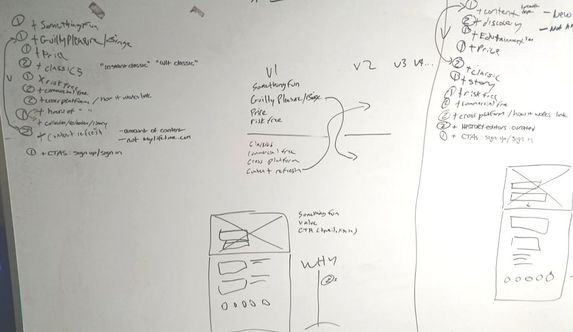
A/B TESTING
In an effort to increase click throughs to sign up for a free trial of an app available on multiple platforms we were asked to rethink the the landing page @ www.historyvault.com. At the time the live page (Test Page below) had multiple CTAs and the value proposition was not clear. After "whiteboarding" ideas and determining the components that had to be above the fold, three designs were presented. The third and final design was chosen and a/b tested against the live page. The third design hit statistical significance and achieved an improvement in users moving forward to step two in the funnel as well as conversion to a free trial.
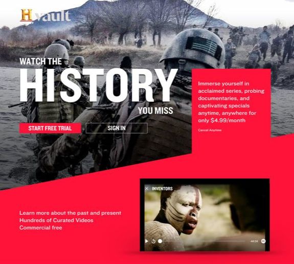
Test page

Design 1

Design 2
Design 3 (Winner)